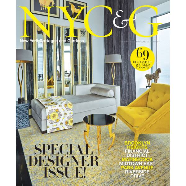
Tell me about your interior design which was featured on the magazine cover of New York Cottages and Gardens' October issue?
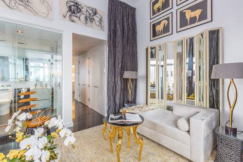
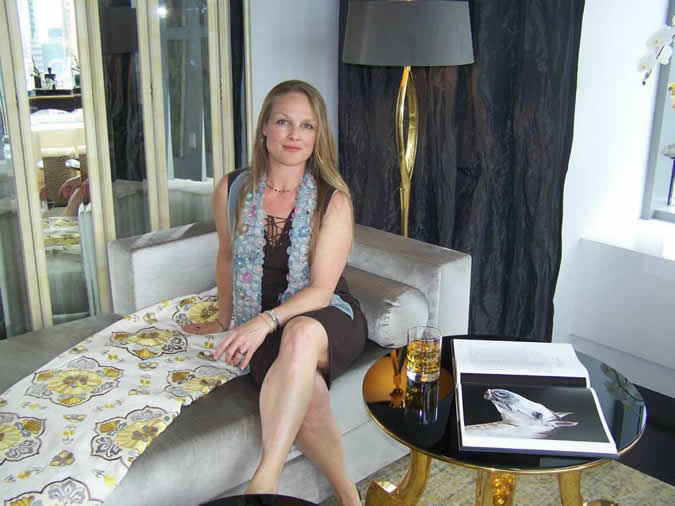
It’s of a room makeover I did as part of the The Designer Showhouse of New York, which was a benefit for Lenox Hill Hospital that took place from mid May thru the end of June. 30 + Interior Designers were invited to decorate luxury residences on the 55th and 56th floor of the W Residency Hotel, located in lower Manhattan. From there the views of the city are spectacular. Each designer makes up 2 bedrooms.
How does that benefit you?
The six week event attracts a large audience and the public is invited to attend through different activities. It’s good PR for the designers, it serves a great cause, and according to event publicity it shows off ‘visionary creations from today’s foremost home and lifestyle designers.'
How would you define your style?
I don’t do anything with a specific style. I’m more eclectic. I have some old things mixed in with new things. You might say I’m eclectic artistic with a modern twist.
In this project, there is no specific style you can pinpoint. Some might say there is an LA look, a little 30’s Hollywood, which is modern. Some would say it’s very contemporary with classical features.
I love your logo. How does that fit in to who you are as a designer?
My logo is a quatrefoil which is a classical element. I believe everything always goes back to classicism, which is then given a modern twist. What I try to do is achieve balance and mix things together but not be clearly defined.
What would you say is in style? What’s out of style?
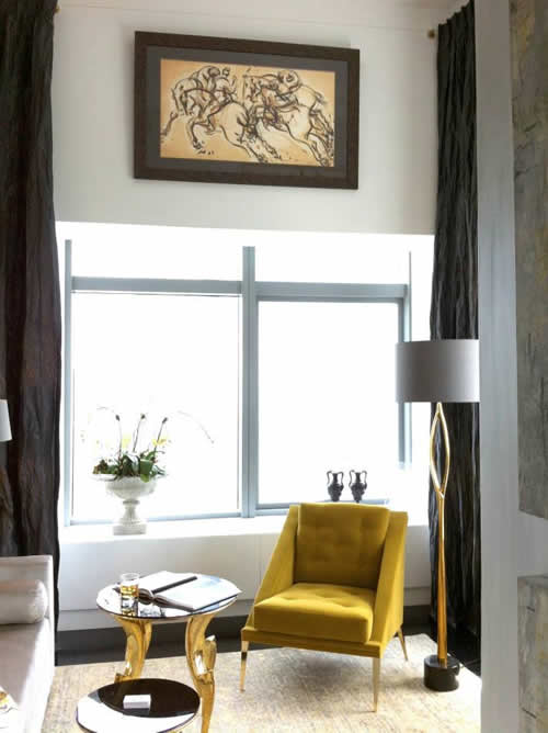
What’s in: Clean lines, plenty of space with air to circulate, lighter and brighter designs, and a more casual and warmer feel.
What’s out: Big, heavy furniture, enormous pieces that are out of scale and rooms that are overcrowded and overly done.
Why do you think that there has been a shift in the trend away from bigger?
A lot of it is your age. Things change and more people are pairing down. People are more healthy and sustainably conscious. This thing about ‘stuff’ is not what it used to be. It may also have to do with what happened to the economy in 08’. There is a 'lighterness' of being.
I recognize the work of artist Heidi Bilezikian, who is from Warwick as well. What drew you to her work?
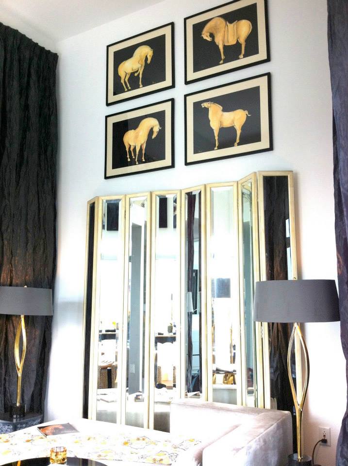
I wanted more abstract art on the walls. I knew her work, which has gold tones and blacks and a horse theme and I thought that would work well with what was going on with the other elements.
What other designs inspired you?
The room is made up of many pieces including beautiful lamps from England, tables such as the marble odegard, beautiful rugs and accessories, sustainable fabrics made by Carnegie Fabrics, Wonderly's Custom Draperies, brass lamps and more. I also used the work of another Warwick artist, Janet Howard-Fatta.
The teen center at the Warwick Valley Community Center in Warwick was one of your recent jobs. Tell me about that project.
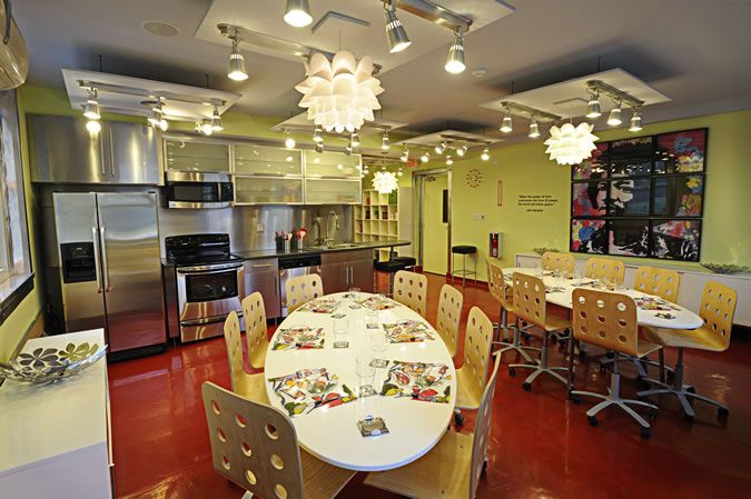
I enjoyed doing it. I wanted to contribute something to the community. Stylistically, I wanted it to have a clean look and to feel spacious, brighter and healthier. Everything that’s there can live a long time. It would be hard to ruin anything in that space. We were on a very limited budget so we used corregated metal to cover everything and gave it a new and fresh look helped by the flooring which was made out of epoxy.
Warwick Valley Living thanks Pamela J. Durante for her fine talents and community contributions.
.....................
 Warwick resident Pamela J. Durante, owner of Atelier Durante Interior Design, is a NY State certified interior designer and past president of the American Society of Interior Designers. Her passion for design took root when she discovered that she enjoyed makingover rooms as a teenager. She graduated from the Parsons School of Interior Design and teaches at the New York School of Interior Design while keeping busy with projects for residential and commercial properties.
